
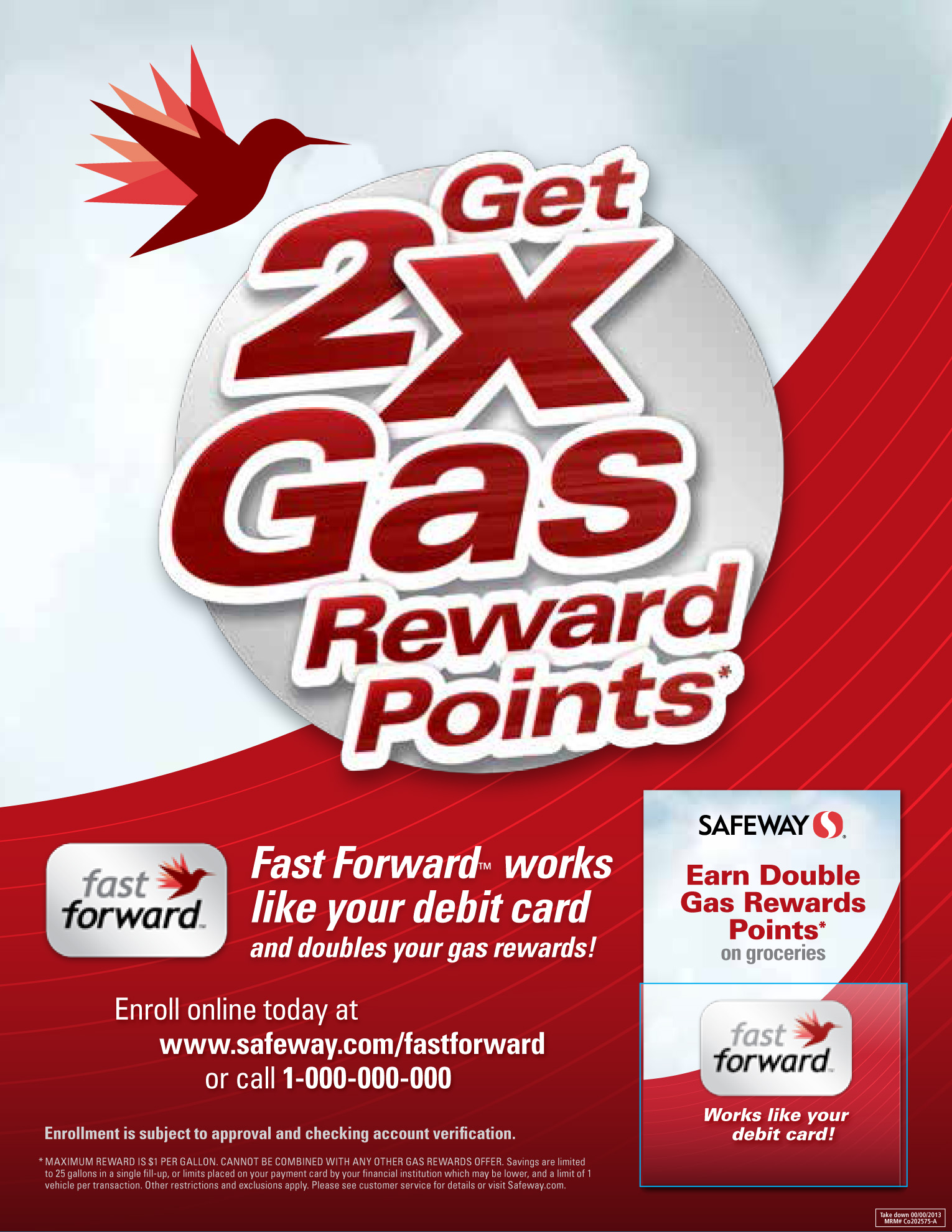
Safeway introduced their Fast Forward debit card with an extra gas points incentive upon enrollment and needed an ironman sign with an brochure holder lug-on to increase awareness. Using some of the program's existing assets, I crafted this sign for maximum stopping power, including a mock brochure pocket.
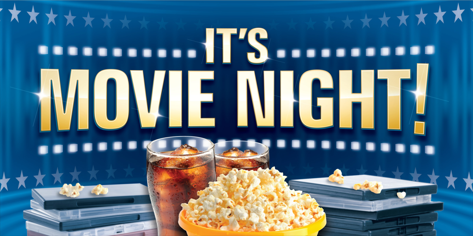
This end cap concept was originally given the green light to produce, but was pulled back and revisited by another designer. Even so, this design had all the box office appeal to catch the eye of pre-Redbox shoppers who were looking for some entertainment to go with their grocery purchase.
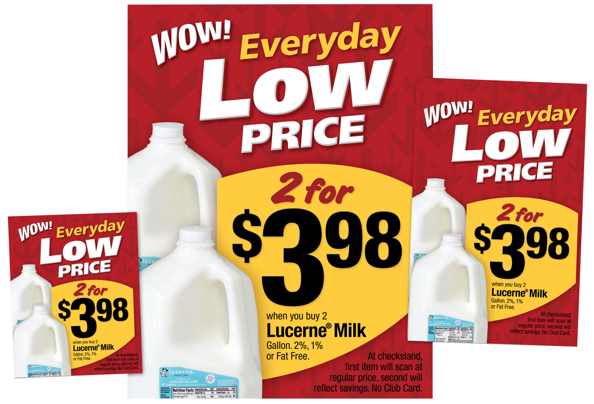
From window clings to ceiling banners, Safeway's ELP (Everyday Low Price) campaign was inescapable. I took the campaign lockup and background my team developed and added a "Wow!" eyebrow, then formatted the offer to live harmoniously within the composition without competing for hierarchy.
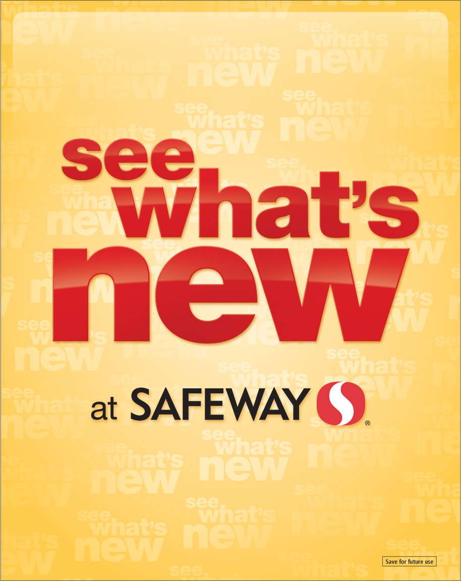
Safeway dedicated a display area for new products that needed a display sign to attract shopper's attention. I used their corporate advertising font family and color palette in a way that not only popped, but captured the shiny, "new" look with graphic styling.
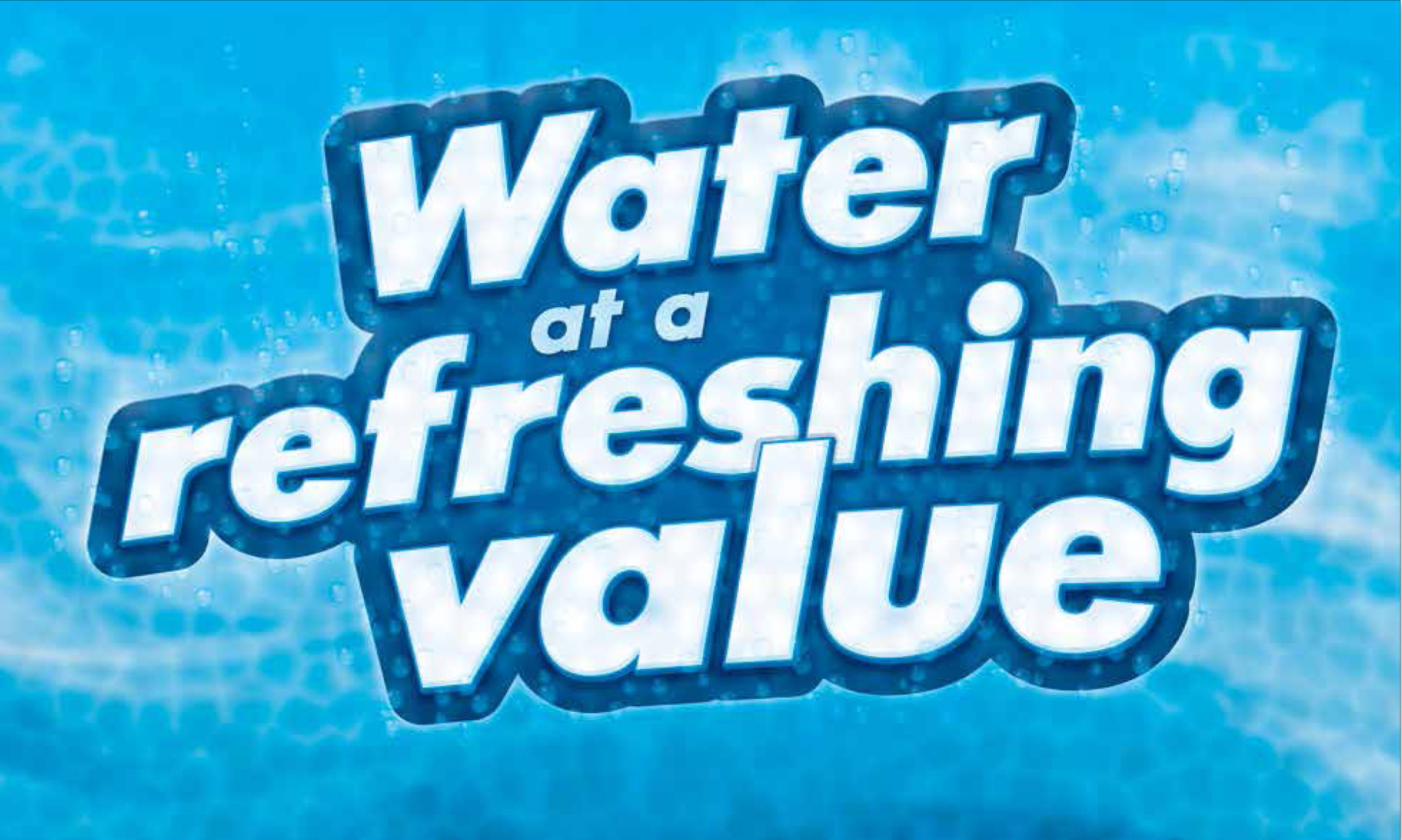
Safeway needed an exterior merchandising sign for bottled water during their summer months. I came up with a few graphically compelling designs and this one was chosen to go to print. It has a look that says "so refreshing, it feels like I've just plunged into a pool of cool water".
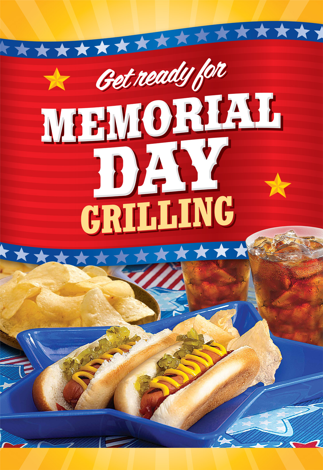
Safeway's Memorial Day campaign stretched across several marketing channels, so after I had developed the look that was to appear in their circulars, I was tasked with translating this into store displays. The graphic style I developed for live type made the messaging easy to apply, but the challenge was taking existing photo assets and making them work for the composition. In the end, this ironman sign served our country with honor.
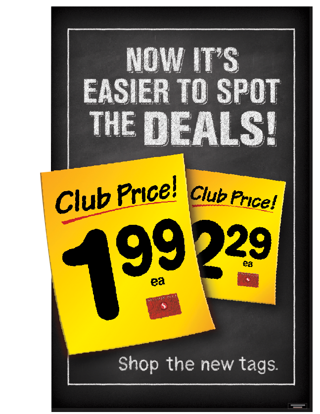
When Safeway launched their "Promise 3.0 campaign, the rollout started with shelf tags. This oddly began during their chalk graphics campaign and thus needed a chalkboard sign to call out the new look. As I was the in-house creator of the chalk style, I was tapped to make sure this ceiling banner looked like chalk, but also had good readability at a distance.
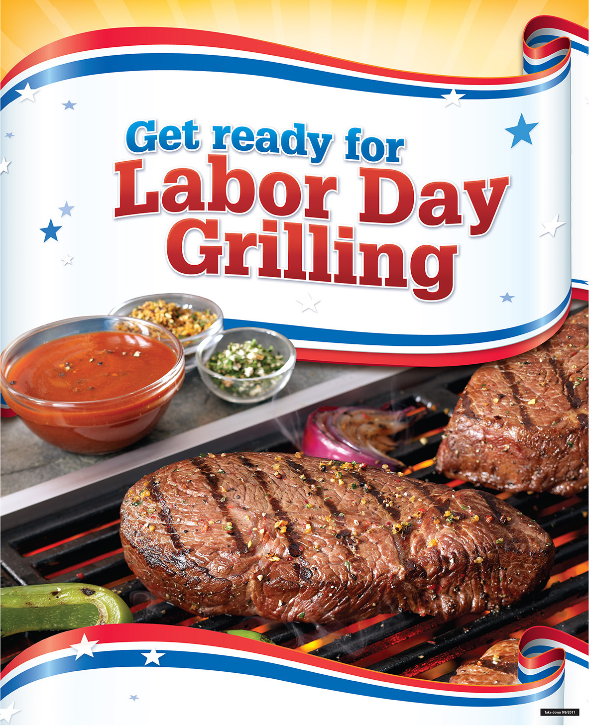
Labor Day! When was it ever a patriotic holiday? Retailers tend to recycle their patriotic graphic assets from Memorial Day & Independence Day to finish out the summer months with a salute to the blue collar folks. So, with that direction, I gave it a touch of patriotism, a little photo editing to the preexisting photo assets and voila! Grill marks and high marks for this thematic ironman sign.
Store Signs
Safeway always had a promotion to advertise which meant opportunity to design interior and exterior banners, end cap displays, ironman signs, window clings, LAD signs, aisle blades, etc. Here's a variety of signs I designed; most of which went to print.


