
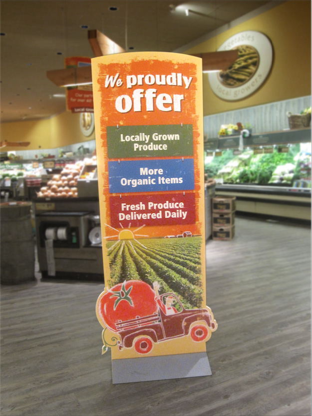
Standee
Hanging Banner
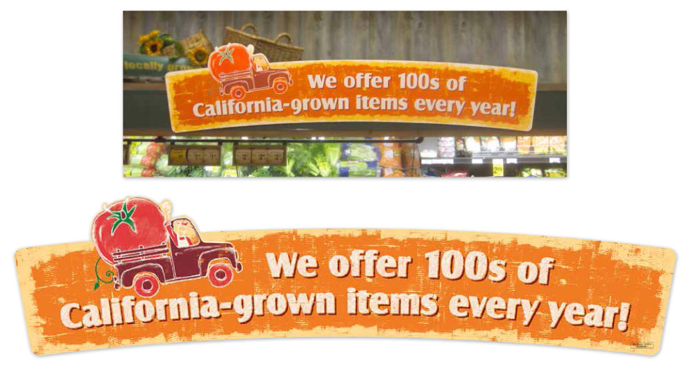
Wet Rack Fascia Sign - This sign comparison demonstrates the last minute font modifications that had to be made to all of the signs. The client was concerned with how small the counters were in the type family, so every letter with a counter had to be manually enlarged for better readability. Once I revised the entire alphabet, I shared a master file with the design team that was assisting with the final builds.
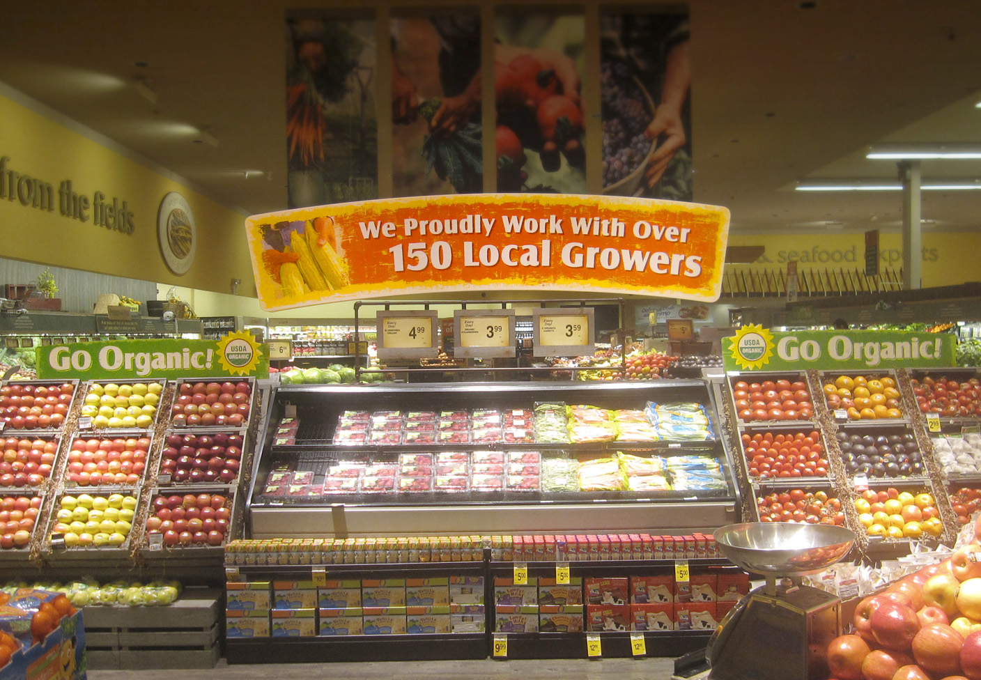
Locally Fresh Produce
As the farm-to-table concept was becoming the latest marketing trend, Safeway needed POS displays to brag on how many local farms they were working with, their growing organic produce section and a graphic style that emoted an agricultural grit. As part of the design team that quickly developed these signs, I had the task of creating the grit style, giving all the headlines a slight arch (with some last minute modifications to the type counters) and building the bleeds and die lines.


